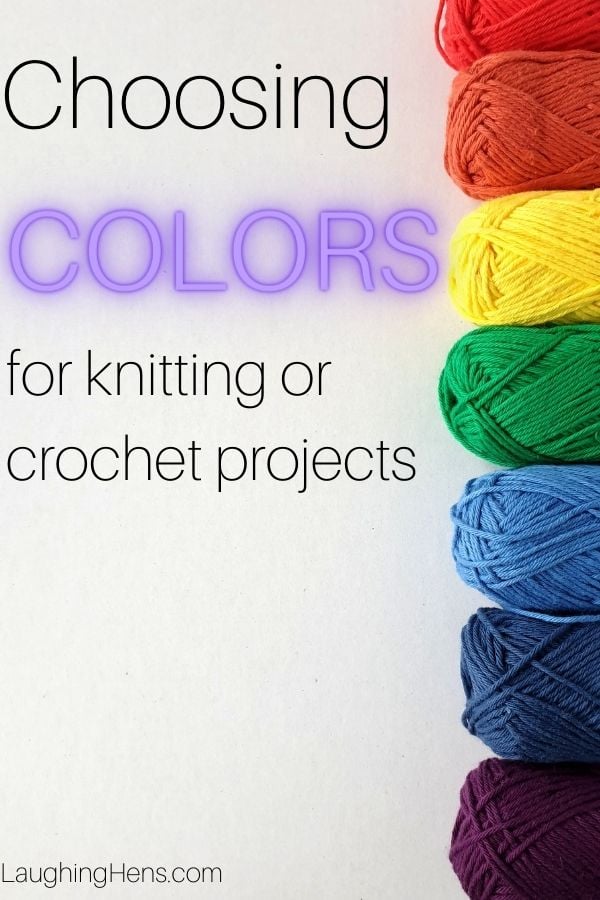
Learn how to choose yarn colors for a crochet or knitting project with our color theory guide!
Choosing colours for a crochet or knitting project, especially a large one like a blanket or a colourwork jumper, can be daunting. With so many beautiful hues to choose from, where do you even start? How can you be sure your shades will work together without the clunky process of trial and error?

In the mid-17th century, Sir Isaac Newton put pen to paper in an attempt to explain the way that colour works. He compared colours to musical notes as an organisational tool, using a D Dorian mode (like using only the white keys on a piano, starting and ending with D) to explain the way that we perceive colour.

Many of us learned the seven colours of a rainbow with the acronym ROY G BIV, which stands for red, orange, yellow, green, blue, indigo, and violet. There are of course colours that our human eyes cannot perceive, like infrared or ultraviolet. Newton had challengers to his theory of colour, including Johann Goethe, who tried to improve on the original wheel with a lightly more complex imagining . Even as early as 1808 when he created this wheel, we can see how early imaginings directly compare to today's more sophisticated wheels that have evolved alongside the technology to create more varied paint pigments, and the advanced screens that allow us to see an immense range of colour.

Goethe's above illustration accompanied his writings on "Allegorial, Symbolic, and Mystical Uses of Colour." During that period in the early 19th century, theories about the psychology of colour evolved that still influence design and advertising today!
Much of these theories are subjective, but are still used as a visual shorthand today. Here are some examples:
Red: anger, passion
Orange: energy, warmth
Yellow: friendliness, happiness
Green: Envy, rebirth
Blue: sadness, calm
Purple: royalty, richness

The colour wheel is made up of primary, secondary, and tertiary colours. Primary colours (red, blue, yellow) can't be mixed from other hues. Secondary shades are mixed from two primary colours (orange, green, and purple). Tertiary colours are created by mixing primary colours with secondary colours, and lead to beautiful shades like yellow-green, red-orange, blue-green, and so on.
A fun way to build a bright, contrasted palette is to pair three colours that are equally spaced on the colour wheel, like orange, purple, and green. This is called a triadic colour palette!

Complementary colours lay opposite each other on the colour wheel, like yellow and purple (seen above), or red and green, or blue and orange. These combinations are bold and bright, a real injection of boldness into your project. These work well in colourwork designs that require contrast to pop, or in blankets.
Using them in projects, for example, you could choose two oranges and two complementary blues, if you wanted to use more than two colours.

For a project with a smoother look, choosing analogous colours is a great option! Analogous colours are next to each other on the colour wheel, and are typically used in a trio, for example, green, blue, and purple. This colour scheme has less contrast than using a complementary shade palette, and doesn't look as bold.
This method typically works best with cool or warm tones, rather than mixing them For example, Red, orange, yellow might work better than pairing orange, yellow, and green (though it might work for your project!).

Another thing to consider when choosing colours is tones. For example, brightly toned colours like the image above go well together as a complementary pairing! However, mixing that neon orange with a blue that was more muted, with an earthier undertone, might not work as well.
When creating your palette, consider the tones you are looking at. Are they neon, pastel, earthy? This isn't to say that tones can't be mixed, but palettes flow better when you choose colours with similar tones.

With many projects, you have to choose a main colour that pairs along with the rest of your palette. In most cases, it will be a neutral or monochrome, in order to let your colours pop.
While this is largely down to personal preference, consider trying something out of your comfort zone! If you are knitting or crocheting a project with bold primary colours, try pairing with a neutral grey instead of black or white.
Neutrals like beige and cream work well with warmer colour palettes that use pinks, oranges, and reds, while still allowing for decent contrast, if needed.
Cool greys play beautifully with the cooler shades on the colour wheel, greens, blues, and purples.
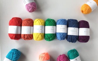
The yarn featured in this article is Rico Ricorumi, small, 25g balls of cotton yarn available in an immense range of shades! It's perfect for amigurumi or other small projects.


